Le Blink

Research and design for an intuitive student dashboard to reduce time-to-comprehension by 52% and improve user delight

Research and design for an intuitive student dashboard to reduce time-to-comprehension by 52% and improve user delight
Company

sdfsfsdf

role

Lead Product Designer
Experience Design, Prototyping, Usability Testing, High Fidelity Mockups, Project Managemen

Timeline

Lead Product Designer
Experience Design, Prototyping, Usability Testing, High Fidelity Mockups, Project Managemen

AS DESIGN LEAD,

I drove the design of a revamped dashboard that enabled users to efficiently manage and track their learning modules across the whole platform.

I drove the design of a revamped dashboard that enabled users to efficiently manage and track their learning modules across the whole platform.

52%

reduction time-to-copmrehension

52%

user satisfaction rating

BUT FIRST, WHAT'S THE PROBLEM?

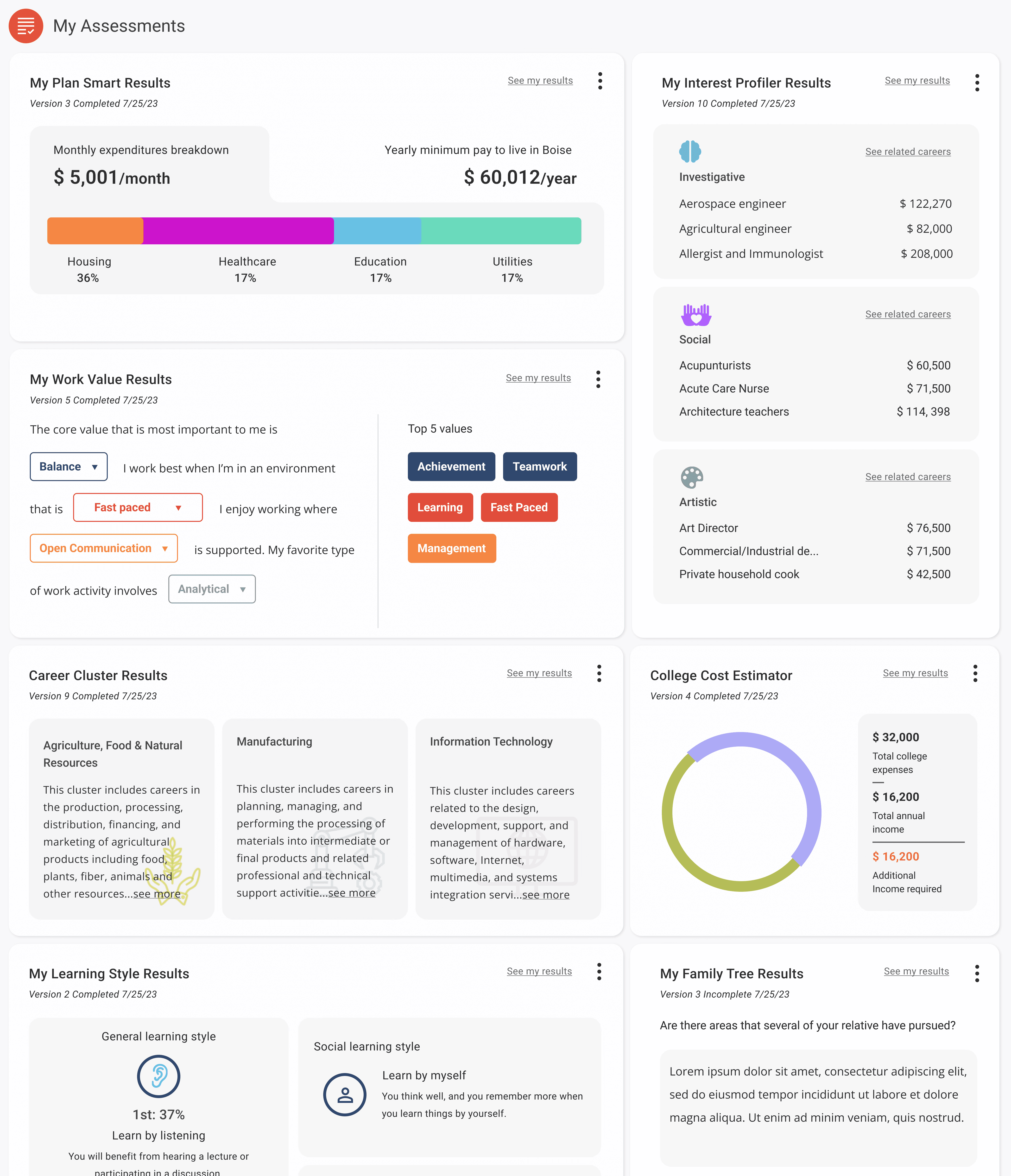
Redesign a visually engaging "end-to-end" dashboard experience in 4 months, for the beginning of the 2024 school year!

The original design team ignored conventional designs for dashboards and built with little to no research and added features as one offs, losing sight of how students truly needed the dashboard to work for their needs.

ANY CHALLENGES FACED?

Next Steps Idaho's CMS platform was built with Wordpress which had significant limitation in coding and functionality.

Take assessments that are easy to access in student dashboard.

Take assessments that are easy to access in student dashboard.

Take assessments that are easy to access in student dashboard.

AS DESIGN LEAD,

I researched scholarly articles and analyzed competitor platforms

I researched scholarly articles and analyzed competitor platforms

Findings showed that…

1) After research and figuring out features, we Prioritization Matrix

1) After research and figuring out features, we Prioritization Matrix

After research and figuring out features, we prioritized what we could on a Matrix

From the list of features I discovered, we prioritized xyzsdlkfj, zlksdsdf, slfkjslkdfjsdf, sdflksjdflksjdflk

From the list of features I discovered, we prioritized xyzsdlkfj, zlksdsdf, slfkjslkdfjsdf, sdflksjdflksjdflk

QUICK—HIGH LEVEL VIEW OF DESIGN PROCESS

1) After research and figuring out features, we Prioritization Matrix

After research and figuring out features, we prioritized what we could on a Matrix

From the list of features I discovered, we prioritized xyzsdlkfj, zlksdsdf, slfkjslkdfjsdf, sdflksjdflksjdflk

From the list of features I discovered, we prioritized xyzsdlkfj, zlksdsdf, slfkjslkdfjsdf, sdflksjdflksjdflk

2) After I figured out what features we should include, I created User persona of how we should implement these features clear structure and tracking…

2) After I figured out what features we should include, I created User persona of how we should implement these features clear structure and tracking…

Since we were short on time, based off stakeh

2) After I figured out what features we should include, I created User …

older relations with students to inform

Wireframes to follow similar conventional dashboard designs

Wireframes to follow similar conventional dashboard designs

It was important that we follow a similar dashboard structure like side bars, events, and bookmarks

It was important that we follow a similar dashboard structure like side bars, events, and bookmarks

Wireframes: Side bar, bookmarks, tabs!

Wireframes: Side bar, bookmarks, tabs!

It was important that we follow a similar dashboard structure

It was important that we follow a similar dashboard structure

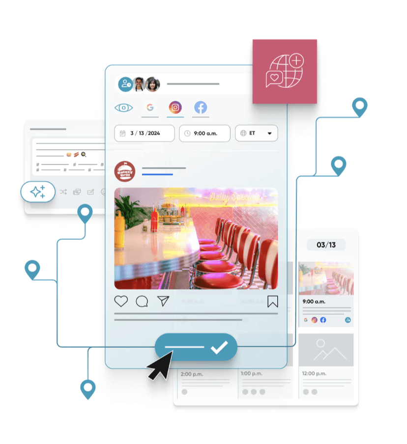
HIGH FIDELITY DESIGN

Interactive prototype

The original design team ignored conventional designs for dashboards and built with little to no research and added

THE RESULTS?

"QUOTE HERE"

The original design team ignored conventional designs for dashboards and built with little to no research and added features as one offs, losing sight of how students truly needed the dashboard to work for their needs.

MY IMPACT?

SOMETHING

The original design team ignored conventional designs for dashboards and built with little to no research and added features as one offs, losing sight of how students truly needed the dashboard to work for their needs.

Image of coffee being poured into a glass

Let's Connect

Feel free to contact me if having any questions. I'm available for new projects or just for chatting.

Olivia Lane